
Want a logo for your new business? There are fun ways to do that, without breaking the bank.
The first most important thing about branding is your logo. Make no mistake, your logo is not your brand. Your brand is how people feel about your company or products. It’s how they react when they see your store or hear your name. Or when they see your symbols.
Those symbols include your staff uniforms, your slogan and your colors. But your logo is the most important symbol of your brand, so you had best get it right.
Here are six things to watch for when creating a logo:
- The right style
- The right symbol
- The right colors
- The words (yes, words!)
- Memorable and recognizable
- Adaptable
The right style
This goes to the heart of the emotional appeal. Do you want something edgy or conservative, modern or nostalgic? Do you want a logo that inspires confidence and security or fun and creativity? Do you want a logo that looks complex or one that is streamlined?
The answers to these and so many questions lie, of course, in the market research you did before deciding to set up your company. Before you defined your target market. Before you chose a name.
The style you choose will be what resonates with the target market. It’s important to choose the right style, because you want to resonate with the right market. If you are selling a wine that should appeal to the tuxedo set, you won’t want to chose a logo style that appeals more to factory workers.
In most cases, you want it to be simple. And these days, logos are getting flatter. Look at Apple. Look at Instagram. Look at my logo.
That’s right, I’m bucking the trend, so don’t pay any attention to my logo.
The right symbol
This is probably obvious, but if your target audience is mid-career, suit-wearing men, you don’t want a purse or a shoe or even a bow tie as the symbol in your logo.
You probably want a suit. Maybe a suit and tie. Maybe just a suit jacket. Perhaps a full body, wearing a suit.
Somehow a mermaid worked for Starbucks [SFX: sound of me scratching my head], but don’t try that at home.
The right colors
Color tells a lot about a brand. People instantly make associations. Any company that wants to be seen as Canadian needs to have a primarily red and white logo. I realized this one day while waiting in a parking lot in Kemptville, surrounded by ScotiaBank, Canadian Tire, Tim Hortons, Dairy Queen, Staples, First Choice, Royal Lepage … and a few other stores with various colored logos.
Different colors will appeal to different age and gender audiences. Different colors (and color combinations) will suggest different types of products or moods. So choosing a color scheme is important.
The words (yes, words!)
Let’s not even ask the question. The answer is, “Yes”. You want your company name, and possibly its slogan, as part of your logo.
But Starbucks doesn’t include its company name.
But McDonald’s doesn’t include its company name.
But Apple doesn’t include its company name.
Did you know that all these three companies began with their names in their logos?
In fact, if you didn’t instantly recognize it, you would think the Starbucks logo was for a bath supply store or a mermaid movie. And the McDonald’s logo could just as easily be for McDermott’s or Marmot Inc. or any company starting with the letter “M”. And the Apple logo… well, that would just make people hungry.
![]()
Until people instantly recognize your logo, keep your name in it. It’s the only way you’ll benefit when people are exposed to it.
Should you also include your slogan? Maybe. But I would suggest not. That could make the logo unwieldy in some situations. You can always publish your logo and slogan together when you want to.
Memorable and recognizable
This can be tricky, but once all the other factors are accounted for, you have to make your logo stand out. People have to see it in a crowd of brands. And they have to remember it the next time they see it.
Adaptable
This can be tricky, too. Once you have a draft design, think about everywhere you will use it. Will it look good when blown up on a billboard? Will it look good when reduced to a Twitter avatar or smaller? Will it look good in both color and black and white?
Let’s create a sample logo
Let’s head over to Designhill. I like Designhill because there are two ways to generate logos.
You can design your own with their DIY logo maker. This is fun and free, and you can spend all day playing and tinkering.
If you don’t have all day, but you do have a little money, you can try posting a design contest. On this site, this is cool because you get more than just three samples from a designer. Multiple designers will bid on your logo. Hint, if you pick a bidding range of $1.00 – $99, you will get fewer samples than if you pick a higher bidding range. Since most people pick the low range, even one range up, $100-$199 will get you much more samples to choose from.
But I’m cheap, which is why I love the DIY option.
Let’s take as an example a new clothing company called “Modern Fit”. It’s a suit company targeting men in their 30s and 40s. That’s a market with spending money, but not generally the top custom-fit market.
After picking an industry, Designhill lets you choose five sample styles from examples. So let’s pick a style that reflects the company’s brand or personality.
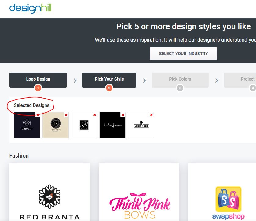
Classy, but not luxurious, and definitely male. We’ll go with something minimalist, and in shades of gray.
Next, we choose a symbol. In the case of our imaginary brand, Modern Fit, we get all sorts of options, such as man, woman, clothes hanger, etc. I’ll select man, then choose an option in a suit.
Next, we get to choose a color palette. We are trying to be classy, and these are suits, after all. So, let’s stick with black and white, possibly with some grey.
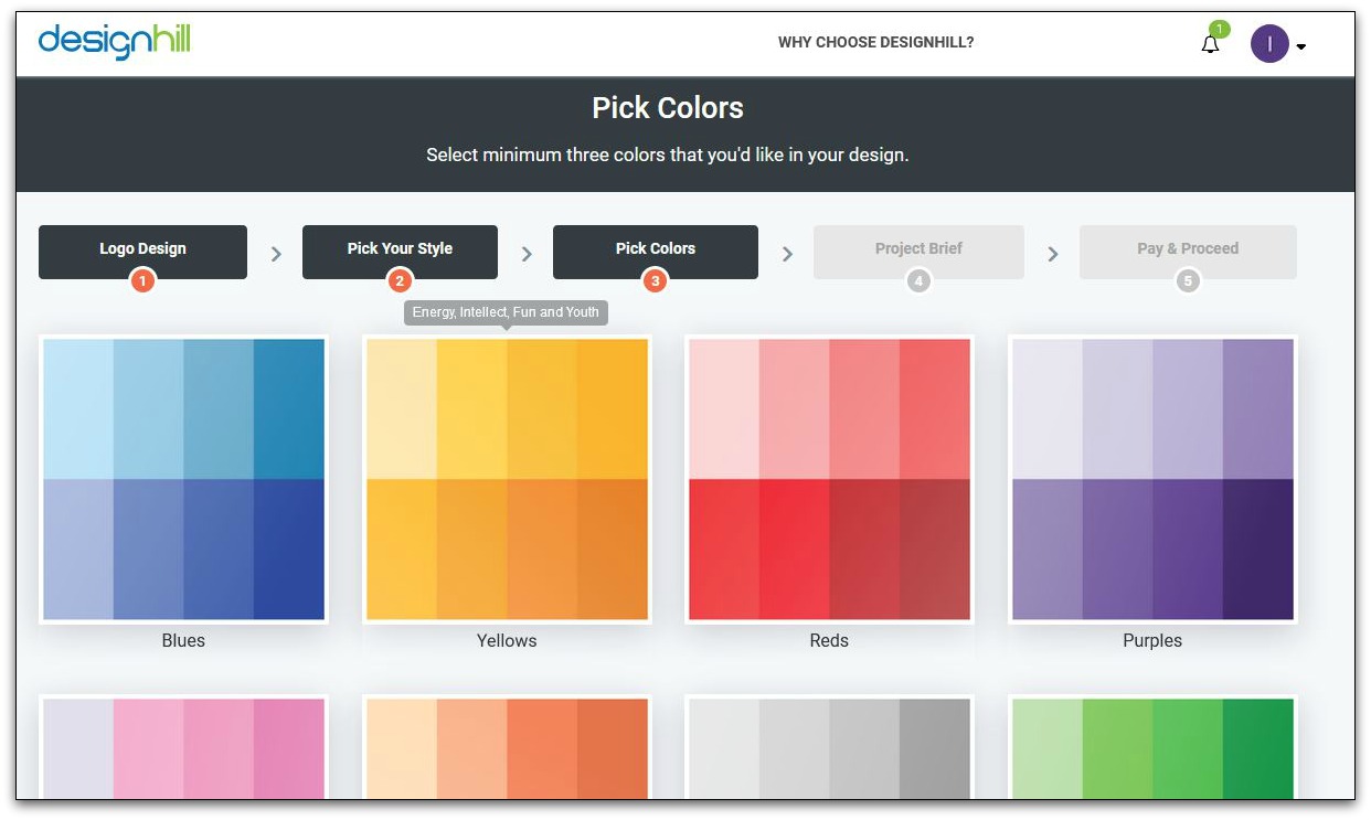
We could pick a single color to go along with it, as long as it’s a classy color, like a navy blue, hunter green or maroon. Definitely no purples or oranges. So, light and dark neutrals, and just for fun, I’ll pick reds, hoping to get a hint of maroon.
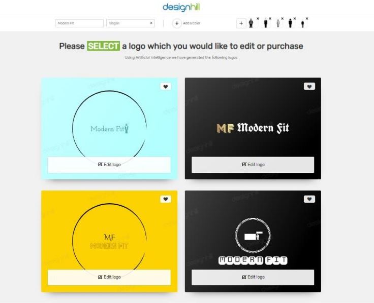
Now you pick a design from many that are auto-generated by the system. To be honest, these are all cool and it’s fun to spend all day tinkering with them. Yes, you can edit them. Here’s what one looks like, just before editing.
![]()
Also, its free to create but the user has to pay when they want to buy.
The cost of creating a good logo is fairly simple, and generally not too expensive. The cost of choosing the wrong logo, can be huge. It can drag down all your other marketing efforts and push up the costs.
Worst of all, it can cost you business for no good reason.
So take the time to do it right. Regardless of where you go or who you get to design your company logo, include these six factors when creating it.

Hi Dave,
Good to be here again. A logo is an important thing to go along with any business. It is, in fact, a brand or identity of our business.
Making a logo at a reasonable rate is really worth to look into.
DesigHill is a wonderful platform where we can develop lovely and meaningful logos. No doubt this is a wonderful logo making platform.
Thanks for sharing it about in a detailed way.
Keep sharing.
Have a great week ahead.
Best
~ Phil